

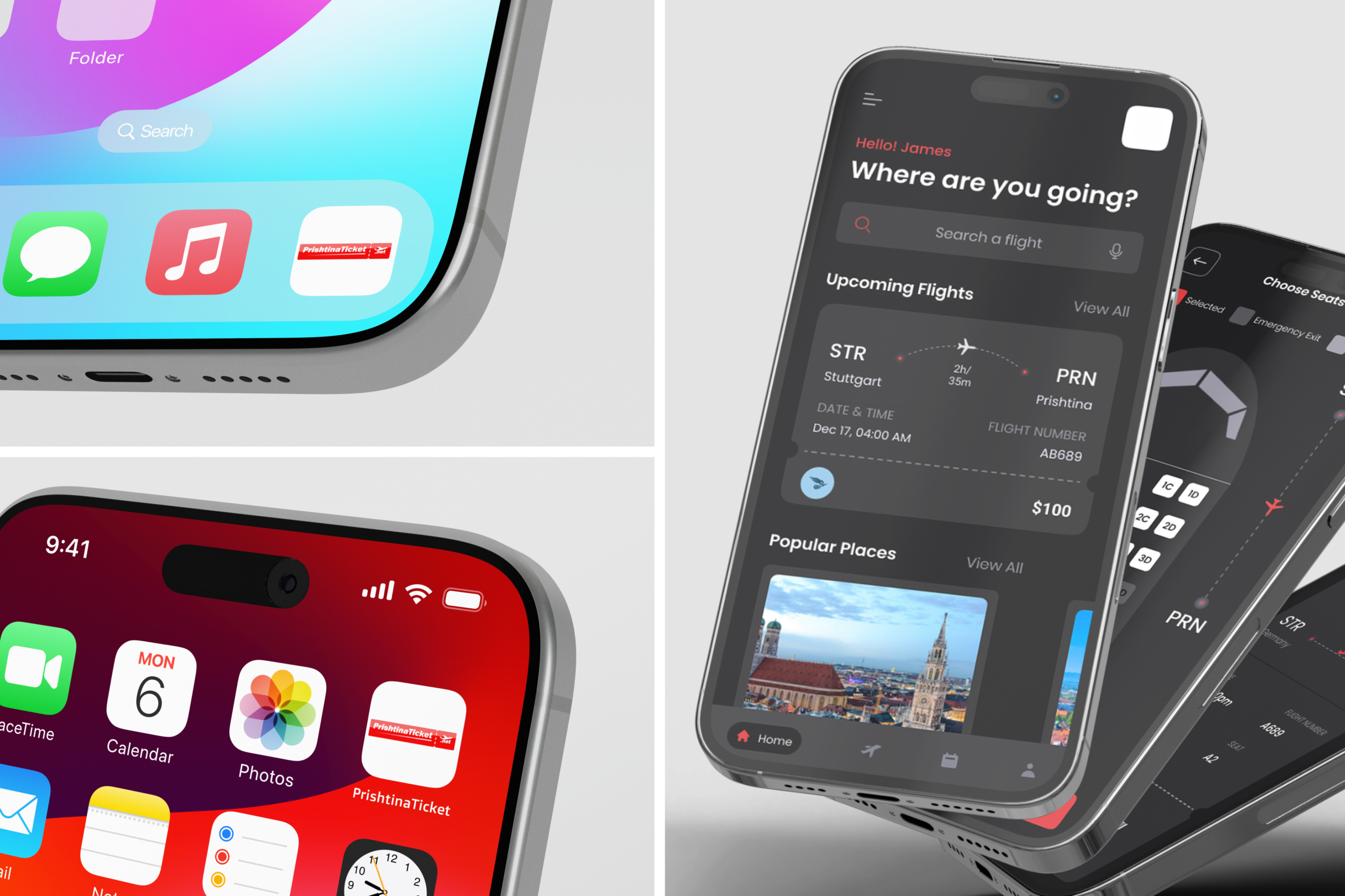
PrishtinaTicket a mobile app I designed for booking flights, and hotels through Prishtina Ticket’s partner network. The goal from the start was simple: take something that usually feels stressful (comparing flights, picking dates, choosing seats, digging up your ticket at the airport) and make it feel calm and straightforward instead.

The whole flow is built around getting someone from “where do I want to go” to a boarded flight with as little friction as possible. Onboarding is quick, the home screen leads straight into a destination search, and both one-way and round-trip bookings follow the same clear path: pick dates, choose a flight, select a seat, fill in passenger details, and land on a boarding pass you can pull up right from your phone — no printing, no digging through email for a PDF.
“I wanted booking a flight to feel as easy as booking a ride — a few taps, and you’re done.”
What I focused on in the design
- A single search-first home screen, so the app gets out of the way and lets you start planning immediately
- A shared one-way and two-way booking flow, so the experience stays consistent no matter which trip type someone picks
- A digital boarding pass with a barcode, saved directly to the app, so tickets live on your phone instead of your inbox
- A seat selection screen built around an actual plane sketch, letting people pick their exact seat visually instead of scrolling a list

The seat selection screen is honestly my favorite part of the whole design. Instead of showing seats as a plain grid or list, I sketched out the plane’s layout so people can see the cabin the way they’d actually experience it — window, aisle, row by row — and just tap where they want to sit. It turns a fairly transactional step into something that feels a little more human, and it was the detail I spent the most time getting right.

Beyond the flight flow, I also designed the surrounding pieces that make the app feel complete: a notifications bar for trip updates, a profile and settings section for managing account details, and a “My Trips” tab where every past and upcoming booking — flights and hotel stays alike — lives in one place. Dark backgrounds with a strong red accent run through all of it, so the app has one consistent identity whether you’re searching for a flight or pulling up a boarding pass at the gate.