


Social Media Design is no longer a luxury; it is often the first place a potential customer encounters a brand. In this moment, the initial impression forms in just a fraction of a second on a scrolling feed, where hundreds of other posts compete for attention.
Making a brand stop that scroll is the exact challenge I set out to solve in this project. This effort centers on clear visuals and concise messaging. The goal is consistency across platforms and quick comprehension for busy readers. By prioritizing typography, color, and rhythm, we guide viewers to act.
Recently I designed a series of social media posts for StarSoft L.L.C. StarSoft builds management systems for retail, restaurants, salons, and healthcare. They also offer digital marketing services. This work demonstrates how thoughtful communication on social channels can support complex products and services.
Here’s a look at the work. The project shows how careful messaging on social channels supports complex offerings. Good design helps brands connect with audiences across industries. In short, strategy, visuals, and timing combine to boost engagement and trust. This example illustrates why thoughtful design matters.
Why Social Media Matters for Businesses Today
Before the visuals, it’s worth saying why this work matters. A few realities shape everything I design:
- Attention is scarce. People scroll fast. A post has roughly a second to communicate who it’s for and why it’s worth stopping.
- Consistency builds trust. When every post shares a visual language, a brand starts to feel established and reliable — even to someone seeing it for the first time.
- Social is the new storefront. For many businesses, the feed is the first impression, long before anyone visits a website or makes a call.
- Design carries the message. Strong colors, clear hierarchy, and clean mockups do more to communicate value than a caption ever could.
Good social media design isn’t decoration. It’s how a brand earns attention and turns a scroll into a click.
The Project: A Cohesive Post Series for StarSoft
For StarSoft, the goal was to present a range of products and services across several different industries while maintaining a single recognizable brand. This approach guides design decisions, including how we present product lines, categories, and service options. It emphasizes clarity, consistency, and a coherent customer experience.
That’s the balancing act: variety in the message, unity in the look. By aligning visuals and tone, we ensure flexibility across industries while preserving a strong brand identity. This consistency helps customers recognize StarSoft quickly, regardless of where they encounter the brand.
Building a Consistent Visual Identity
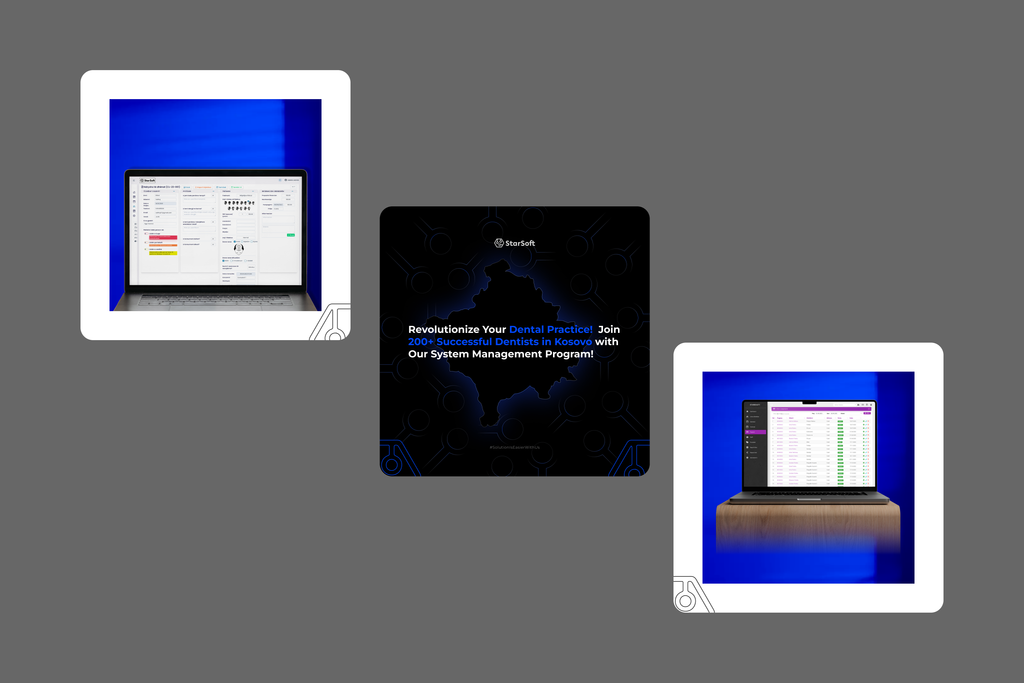
The thread that ties the whole series together is a shared visual system. This system features deep dark backgrounds and a bold blue hexagon motif. It also uses realistic device mockups showing the actual product in use. This coherent design language unifies posts across topics. Viewers recognize the brand and its message through this consistency.
The consistent visuals give every post a sense of belonging to the same family. No matter the topic, the audience experiences stability and cohesion. That familiarity strengthens trust and reinforces overall brand recognition. Over time, this consistency supports engagement and recall across channels.
[Image: 2–3 posts that highlight the hexagon motif and dark-background style]
Speaking to Different Audiences
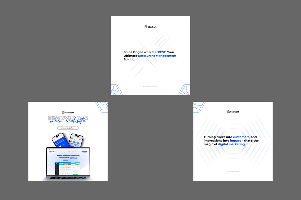
Each industry has its own needs, so the posts were tailored to speak to different audiences — salons, restaurants, healthcare, retail, and more — while keeping the core StarSoft identity intact. This approach ensures relevance across sectors and maintains branding consistency across campaigns.
The design flexes to fit the message without ever losing the brand. It stays consistent across formats and channels, reinforcing recognition and trust for StarSoft.
[Image: 2–3 industry-specific posts — e.g. the salon, restaurant, and healthcare posts]
Product in Action, Not Just Words
Wherever possible, I used device mockups to show the software actually running — dashboards, screens, and interfaces in realistic settings.
Showing the product in context makes it feel real and trustworthy, far more than a text claim could.
What I Took Away From This Project
This series was a reminder that great social media design lives at the intersection of clarity and consistency. Every post has to work on its own in a busy feed, and every post has to belong to something bigger. Getting both right is what turns a set of images into a brand people remember.
If you’re a business trying to make your mark online — or a fellow designer thinking about brand systems — I hope this gives you a useful look behind the scenes.