


I wanted to write about a project I’ve been working on for a while: the full UI/UX design for Quantum, a platform that sits at the intersection of AI chat tools and blockchain. This post is less about the product pitch and more about the design process — where the idea came from, the decisions I made along the way, and what it actually looks like now that it’s built.

The starting point was simple: I kept seeing AI products and crypto products designed like they belonged in two completely different worlds. AI interfaces tend to feel soft, conversational, almost playful — think rounded chat bubbles and friendly copy. Crypto interfaces tend to feel technical and dense, full of charts, tickers, and jargon. I wanted to see what it would look like to actually merge those two visual languages into one coherent site, rather than bolting a token page onto an AI product as an afterthought.
“I didn’t want two products stitched together — I wanted one interface where the AI chat felt native to the same world as the blockchain elements, not a plugin sitting on top of it.”
What I focused on in the design
- A single hero section that introduces both the AI and the “quantum” concept at once, instead of splitting them into separate landing pages
- A conversational chatbot UI (debugging help, Q&A, image and audio generation) designed to feel approachable rather than clinical
- A darker, more technical visual layer for the tokenomics and roadmap sections, so the blockchain side still reads as trustworthy and structured
- A roadmap laid out in clear phases, so visitors can see the project’s progress at a glance rather than digging through a whitepaper

The chatbot section was the part I spent the most time on. I wanted it to demonstrate range — fixing a snippet of code, answering a casual question, generating an image — inside the same visual container, so a first-time visitor immediately understands what the assistant can actually do without having to read paragraphs of marketing copy. Showing real interaction examples directly in the design did more work than any feature list could.
The roadmap and tokenomics sections were the harder design problem, honestly. Blockchain content is naturally dense — vesting schedules, phase breakdowns, token allocations — and I didn’t want that density to fight with the cleaner, friendlier feel of the AI side. I ended up treating that section almost like a separate “mode” visually: same color system, more structured layout, so it still feels like the same product but signals “this part needs your attention” a little more clearly.
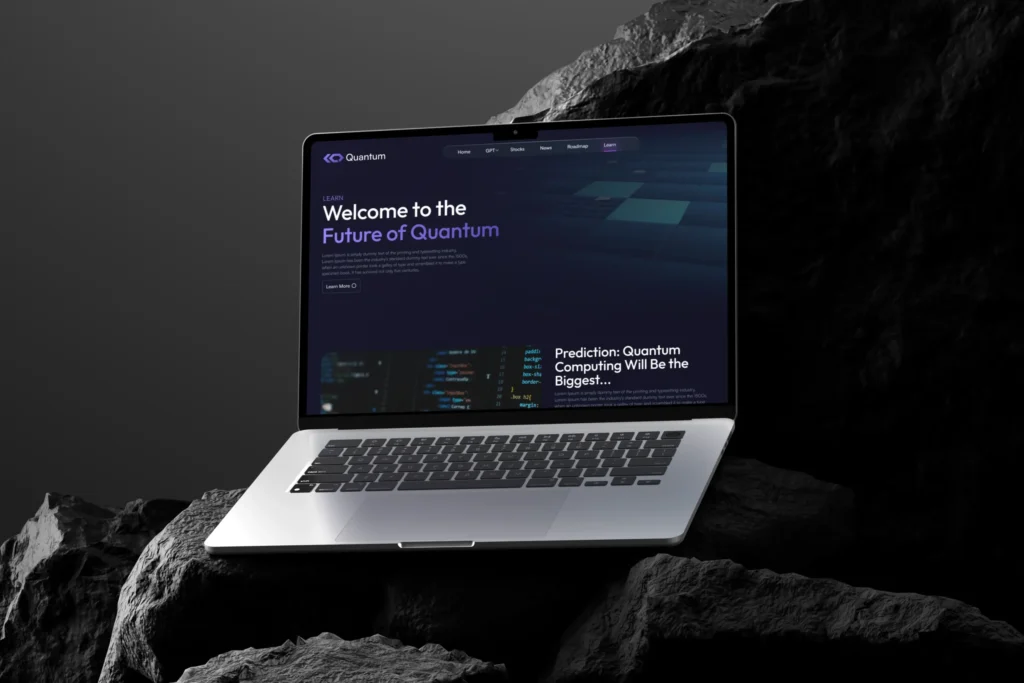
Looking back, the thing I’m proudest of is that the site doesn’t feel like two ideas competing for space. Whether someone lands on it to try the chatbot or to read about the roadmap, it reads as one connected system — which was really the whole design challenge from day one.